Hassle free parking for all your event parking needs
2UX designers
2 Django Developers
3 Full-stack Developers
Duration
Ongoing
Challenge
Event attendees often struggle to find convenient, real-time parking assistance. Organizers, in turn, face logistical headaches coordinating multiple parking venues, attendants, and last-minute changes. PMR aims to simplify this by creating a seamless, multi-channel experience that serves both event-goers and organizers.
Impact
Avg booking time: 43 sec
93% task success rate
60% drop in "parking panic" reports post deployment
Estimated reduced overflow lot usage by 23%
Stack


93%
People successfully navigated the application to complete tasks without any major issues.
43 sec
Average booking time.
Role
As a UX designer & a Scrum Master for the project, I worked with the product owner, developer team and the team of designers in building 3 mobile prototypes, 2 desktop prototypes and successfully setting up the User acceptance testing. I've also conducted the Scrum ceremonies for the sprints to efficiently track the progress of the project and ensure incremental product delivery.
Goals
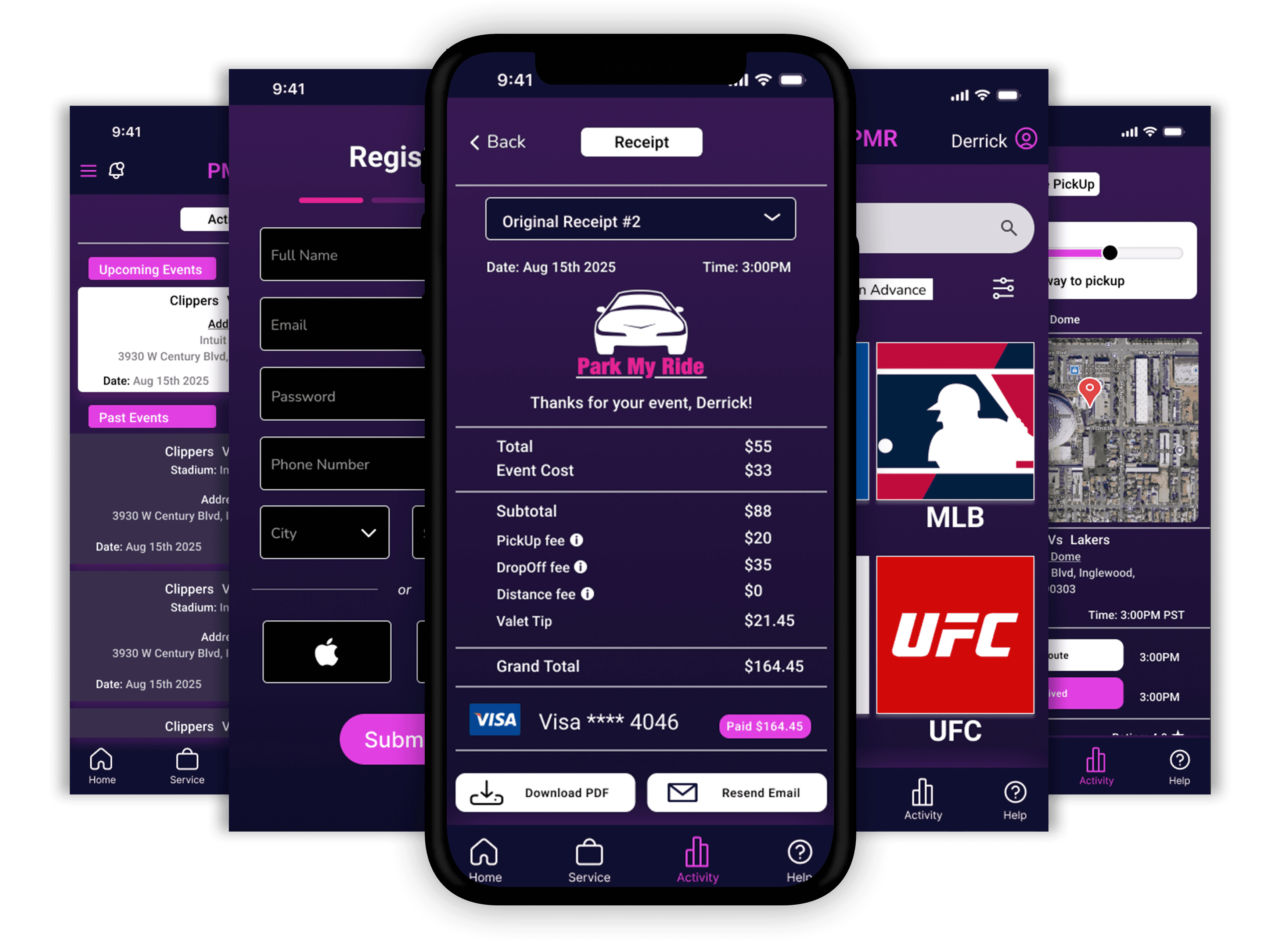
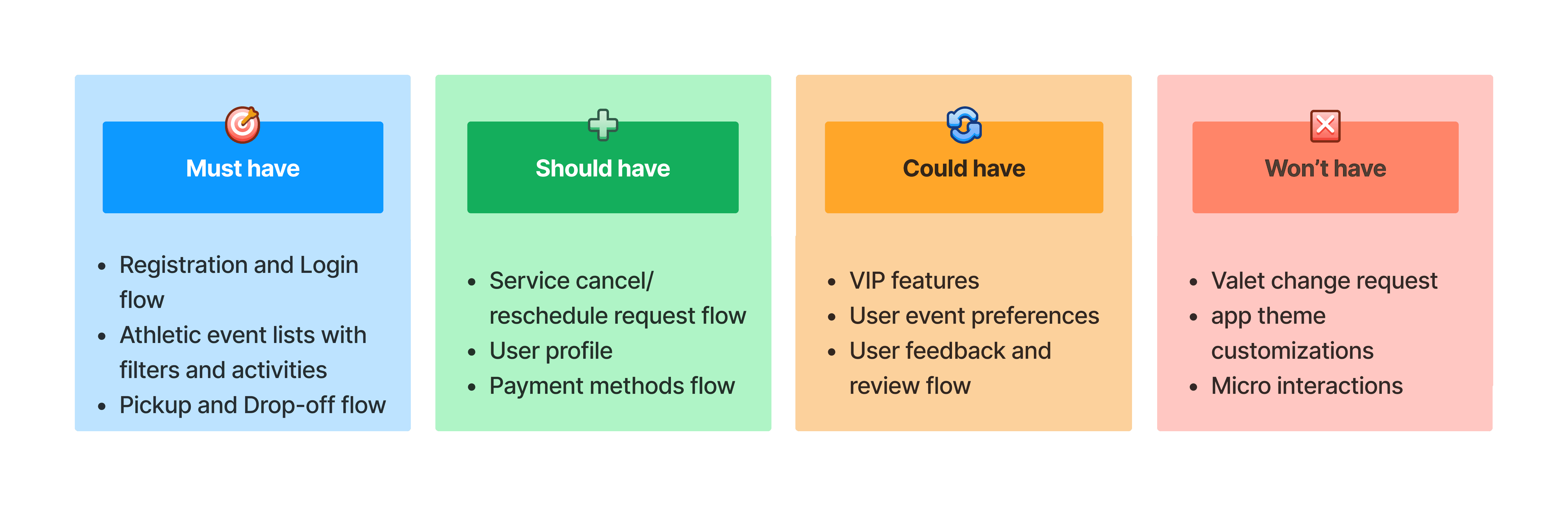
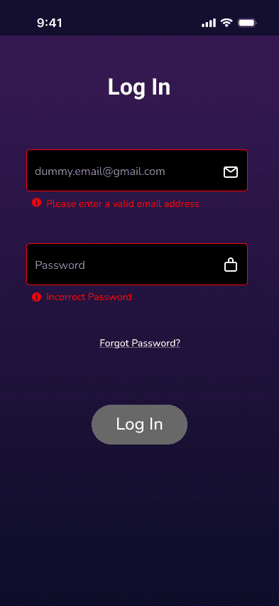
Enable attendees to book & manage valet parking with ease through mobile app
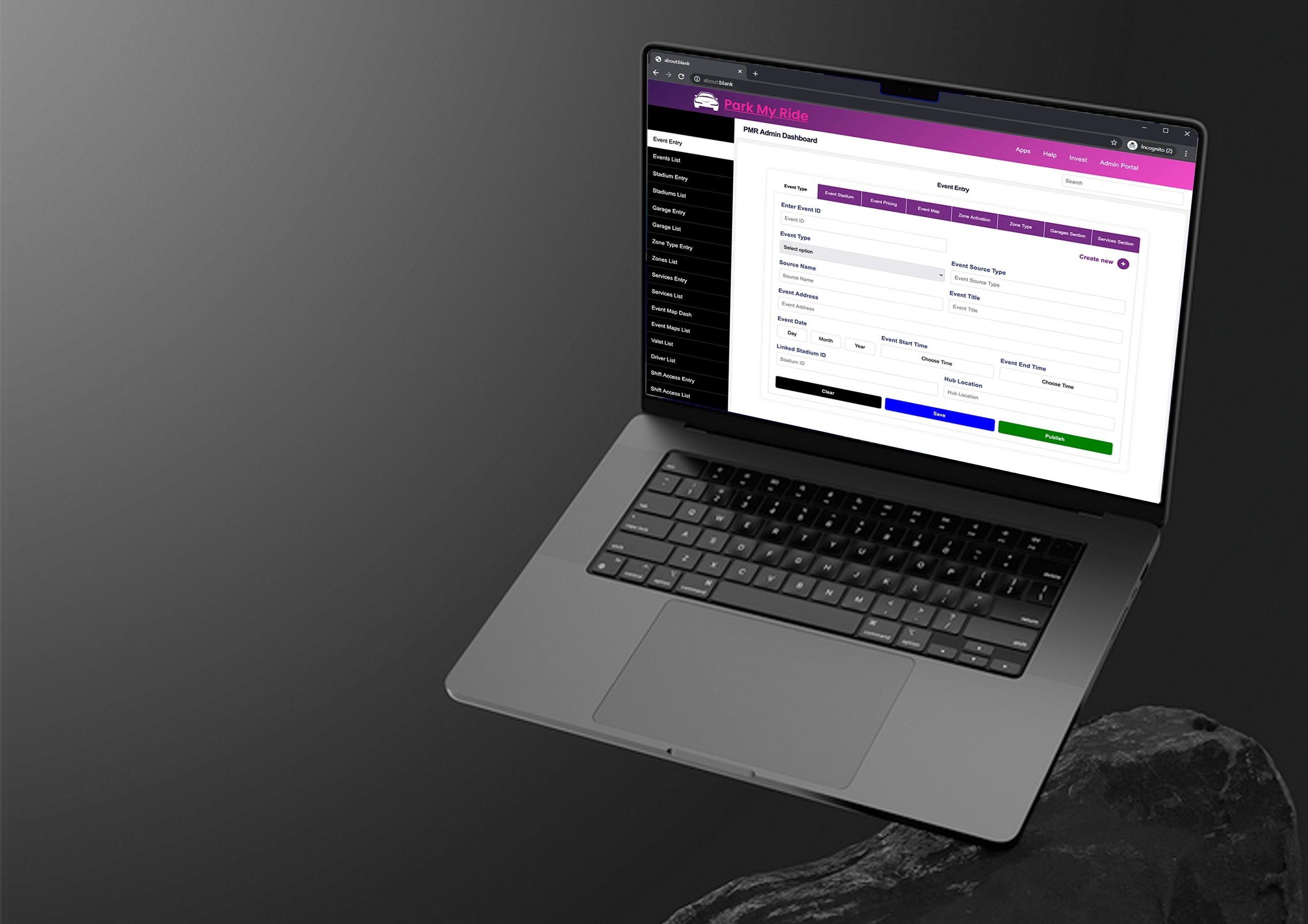
Help admin manage parking zones and attendants in real time with dashboard
Provide attendants with intuitive tools for on-demand pick-up & drop-off of vehicles
User Research
Methods:
5 Contextual interviews (3 attendees, 2 event Organizers)
Online Survey (82 responses)
Competitive analysis (3 Companies)
Insights:
70% of users find parking to be the most stressful part of attending large events.
Event organizers waste 15-20% of parking capacity due to poor coordination
Attendants struggle with slow check-in flows and no-show identification
Persona
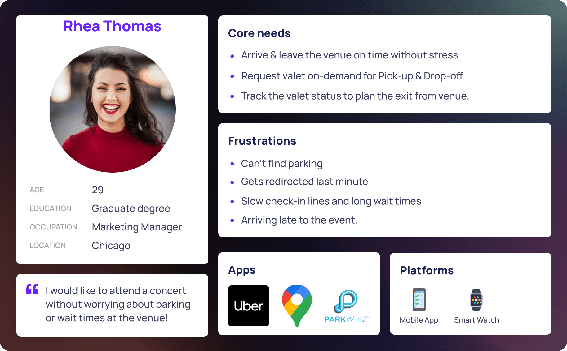
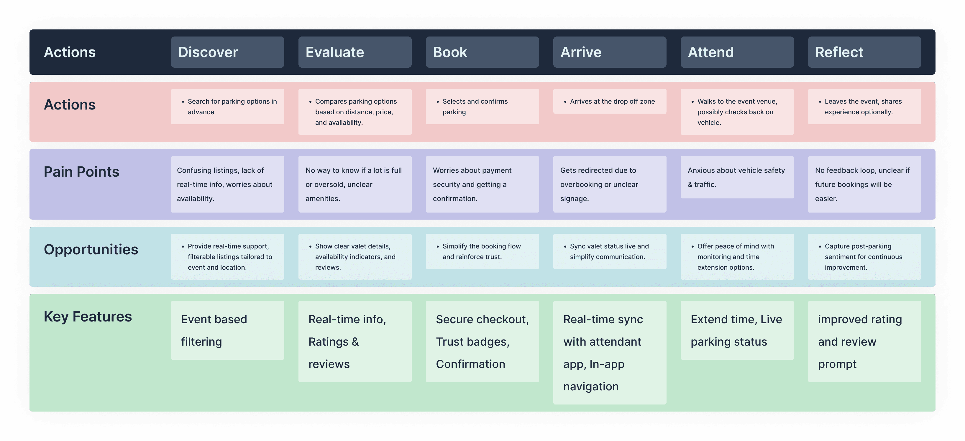
User Journey Mapping
With the personas in place, I mapped out the attendee journey from searching for parking to attending the event, to pinpoint specific pain points & design opportunities.
Mobile prototype
I started prototyping the application using the Lo-fi sketches as foundation. The sketches provided a basic idea of the requirements for each screen, connecting multiple tasks together seamlessly.
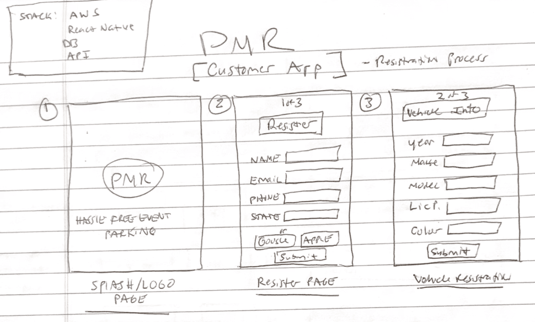
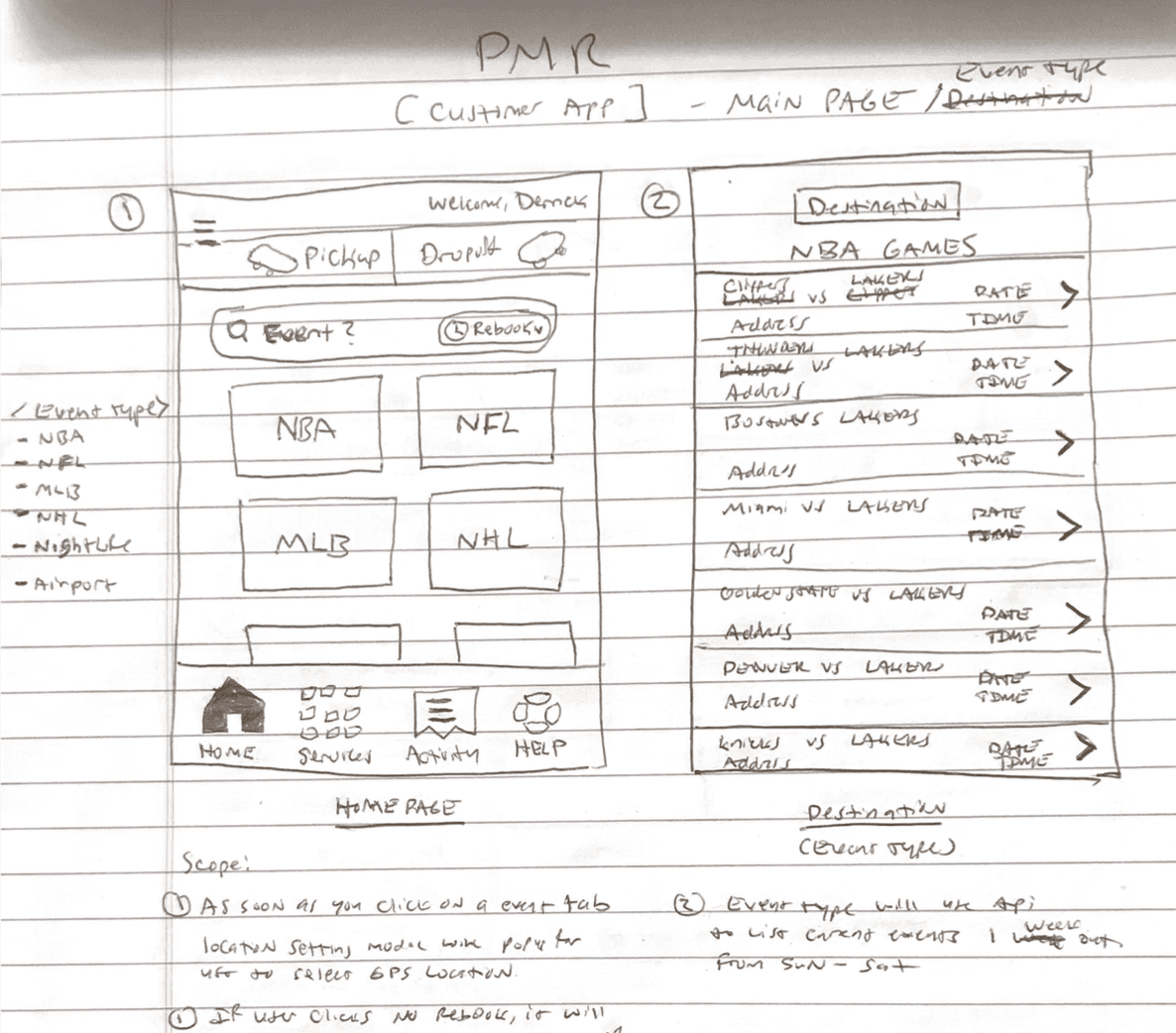
Wireframes help brainstorm and resolve the user flows derived from the scenarios drawn from the Persona and user journey mapping.
Below is an early stage flow of interactions starting from the homepage to accomplish profile creation, Pick-up & Drop-off booking and advance booking flows.
Usability Testing & Iterations
Ran unmoderated tests & Maze with 10 users
Findings:
90% completed booking in under 45s
Real-time valet/driver status was preferred on homepage
Users wanted a confirmation before handing over the vehicle
65% users struggled with contrast on confirmed pick-up/drop-off button
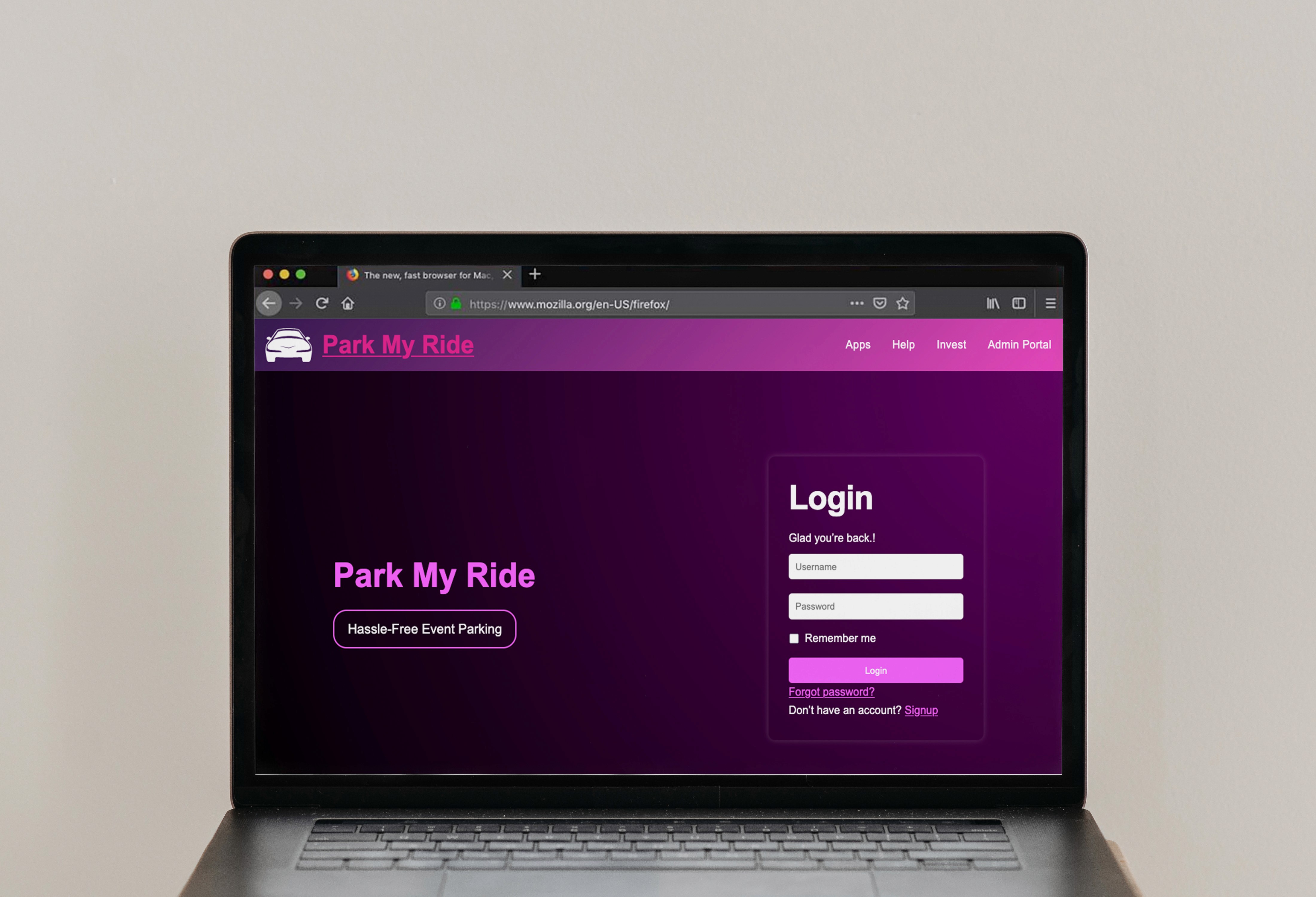
Hi-fi prototype
Incorporating the necessary changes based on the findings from the usability testing, a hi-fi prototype is created on Figma for Customer experience, Driver/Valet experience, the Dashboard and the smartwatch interfaces.
Microinteractions
Microinteractions to confirm task completion, error identification, activity status etc. are designed to allow users to complete tasks with confidence improving user experience.
Some microinteraction snippets from the prototyping.
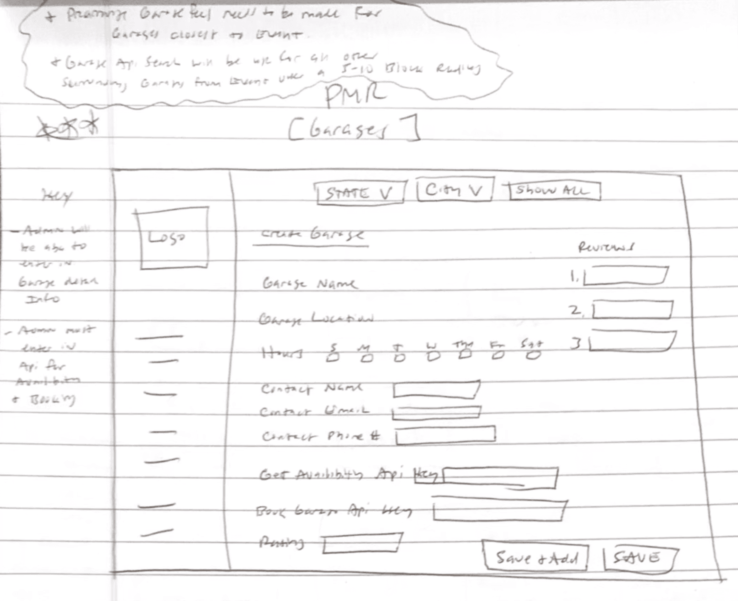
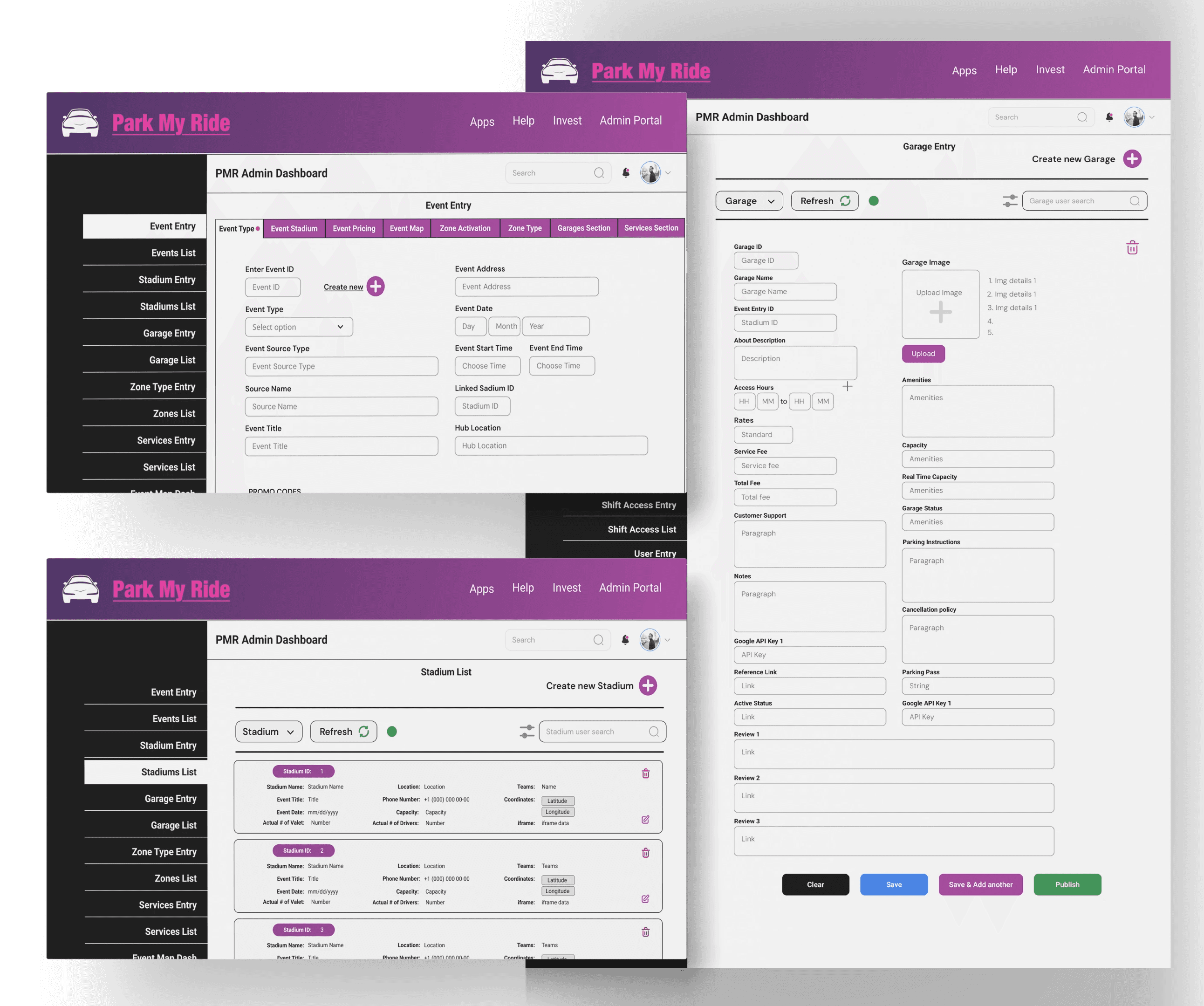
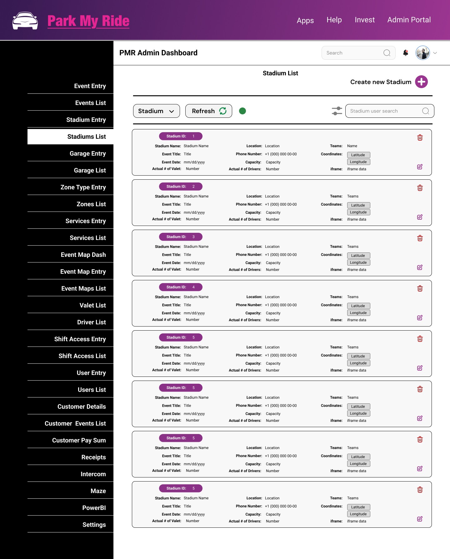
The Dashboard
The operational dashboard for the application allows user to create events, garages, stadiums etc. as required along with the ability to update and track the status of the activities in real-time. The dashboard works in synchronization with the Customer and Valet app.
I built the dashboard prototype and also building it ground up on WordPress with custom html, css, JavaScript and implementing API calls for all the datasets in the dashboard.
The following are some of the screens designed in collaboration with the database engineers and the product owner based on the foundational sketches and the Django database requirements.
26
Sections in the Sidenav
200+
Input fields synchronized with the database
A/B Testing
To compare the effectiveness and user engagement of two data presentation formats (Option 1 and Option 2) in terms of clarity, user readability, and ease of data interpretation.
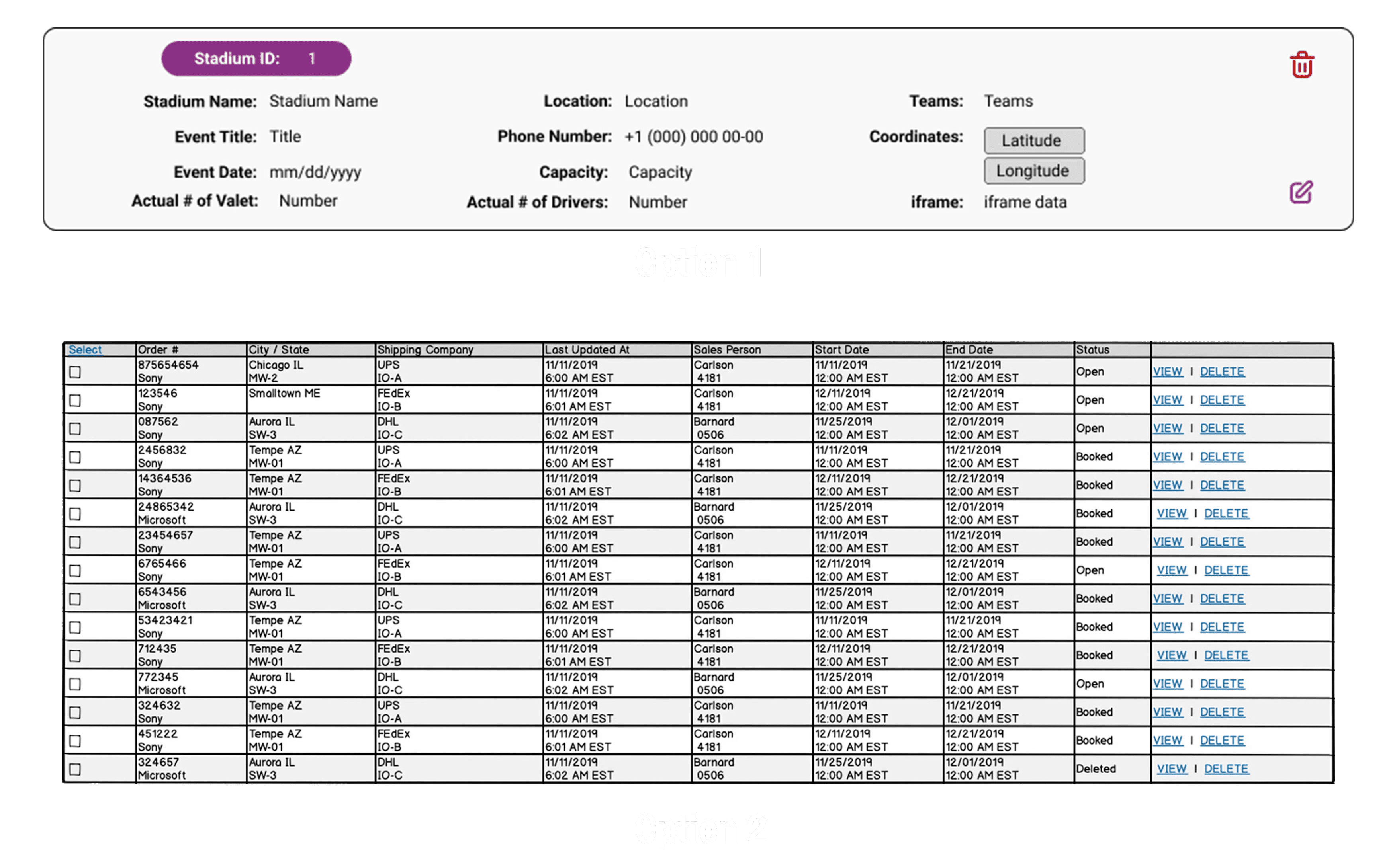
Test Variants
Option A (Option 1): A clean, well-organized design with headers, and actions that make data more accessible.
Includes icons and structured fields (stadium name, event title, date, location, etc.).
Dynamic elements like "edit" and "Delete" buttons.
Columns are grouped logically with space for easy navigation.
Option B (Option 2): A basic table design that is more compact and straightforward, but lacks visual cues or grouping.
Contains just rows of data, organized in columns.
No visual separation for individual pieces of data, which may be harder to read quickly.
Results:
1. Time to Completion:
Option A: Average time to extract data was 15 seconds.
Option B: Average time to extract data was 25 seconds.
Conclusion: Option A is faster for users to interpret key data, likely due to its cleaner organization.
2. Error Rate:
Option A: Error rate was 5% (only minor navigation errors).
Option B: Error rate was 20% (users had difficulty finding specific data points).
Conclusion: Option A results in fewer errors, potentially because of its more structured layout and visual groupings.
3. Satisfaction Rate (Survey Response):
Option A: 90% rated it as "easy to understand".
Option B: 60% rated it as "somewhat difficult to read".
Conclusion: Option A provides a much clearer and more user-friendly interface based on user satisfaction.
4. Engagement Rate:
Option A: 75% clicked "View" or "Delete" buttons at least once.
Option B: 45% clicked "View" or "Delete" buttons.
Conclusion: Option A encourages more user interaction, likely due to its better visual appeal and clearer call-to-action elements.
5. Scroll Behavior:
Option A: Users scrolled 30% less compared to Option B.
Option B: Users had to scroll through more rows to find key information.
Conclusion: Option A’s design likely makes it easier to scan information, reducing the need for excessive scrolling.
6. User Preference:
Option A: 85% preferred Option A.
Option B: 15% preferred Option B.
Conclusion: The majority of users found Option A more visually appealing and easier to interact with.
Impact
25% improvement in task completion after A/B testing
30% improvement in user engagement after A/B testing