Why is bad taste Ubiquitous?
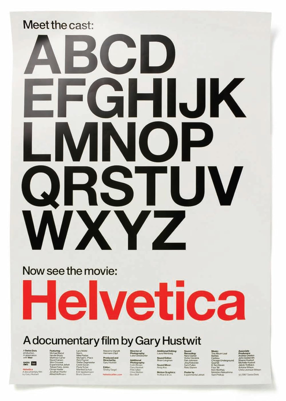
A short discussion post on the documentary "Helvetica" by Gary Hustwit.
Why is bad taste Ubiquitous?
A short discussion post on the documentary "Helvetica" by Gary Hustwit.
It is fascinating to see designers talk passionately about typefaces and have very strong opinion on Helvetica! I was aware of how common Helvetica is/was but watching this documentary just put that knowledge into perspective and I was nowhere close to the reality of it. Erik Spiekermann’s rhetorical question “Why is bad taste Ubiquitous?” Stands out for me in the documentary. I don’t believe Helvetica is necessarily a bad font and I agree with the analogy of “Perfume of the city”. Helvetica is a fascinating font because of its neutral and very human familiarity along with its confidence & accessibility. The duality of it being cheeky and sober based on the context, being open to interpretation makes it special, I think. Some people love it and some are disgusted by it, I think the most important thing is that it gets the job done; it communicates clearly and as mentioned in the documentary it “says everything”. Another important thing that stood out for me in the documentary is the emphasis on having an eye for design and the “programs (software, I believe) don’t give it to you”. I wish there was a part in the documentary where people in the wild sharing their thoughts on the presence of Helvetica around them, if they notice it, does it bother them being everywhere or they don’t really care?
Poster Source: IMDB